Club Twenty Ten
Deliverables
The challenge was to create a distinctive identity that felt at home in the world of padel without looking like another sports brand. Club Twenty Ten is as much about the connections made off the court as the game itself, so the branding needed to balance sport, socialising and networking with a sense of personality and community.
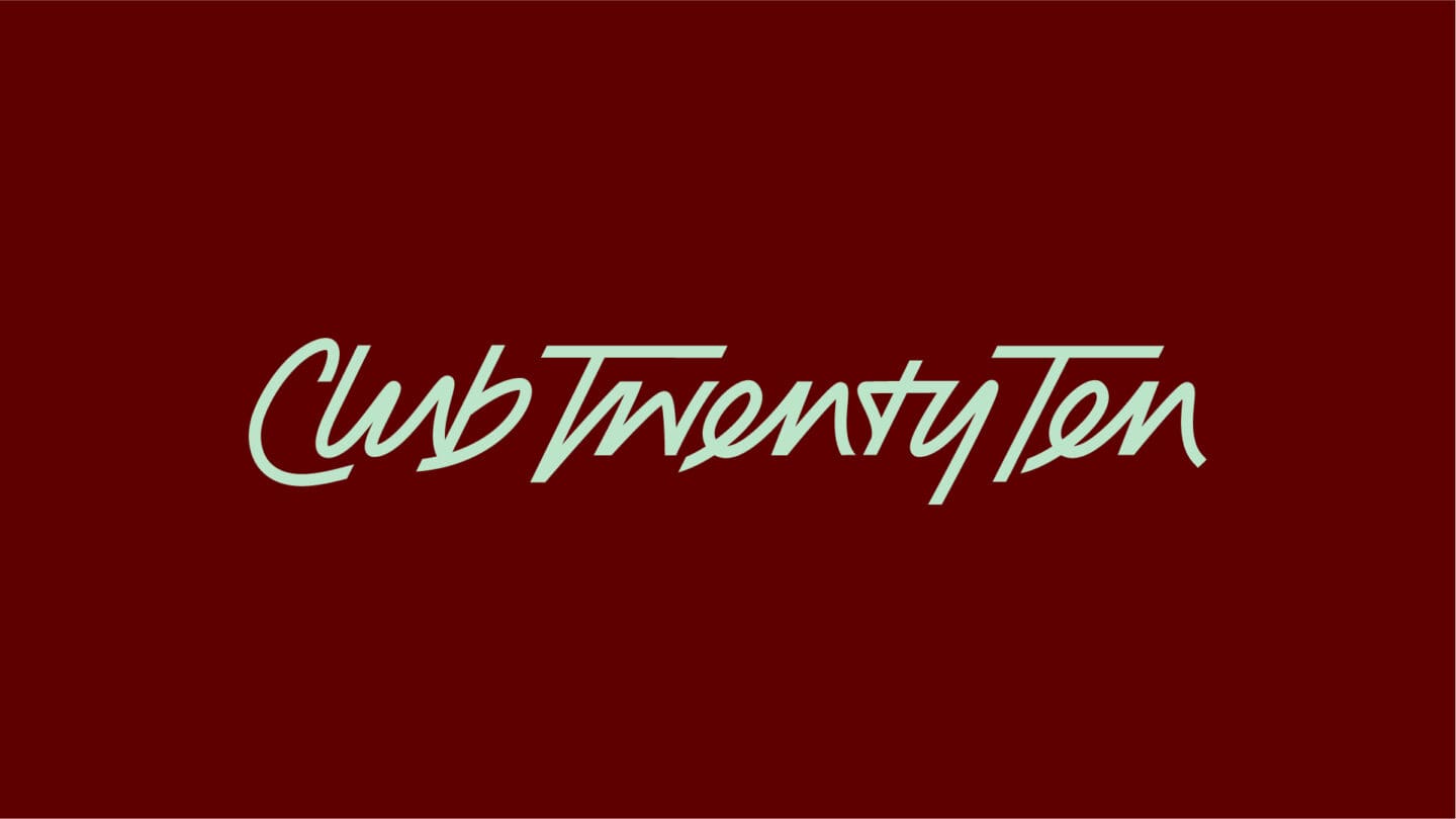
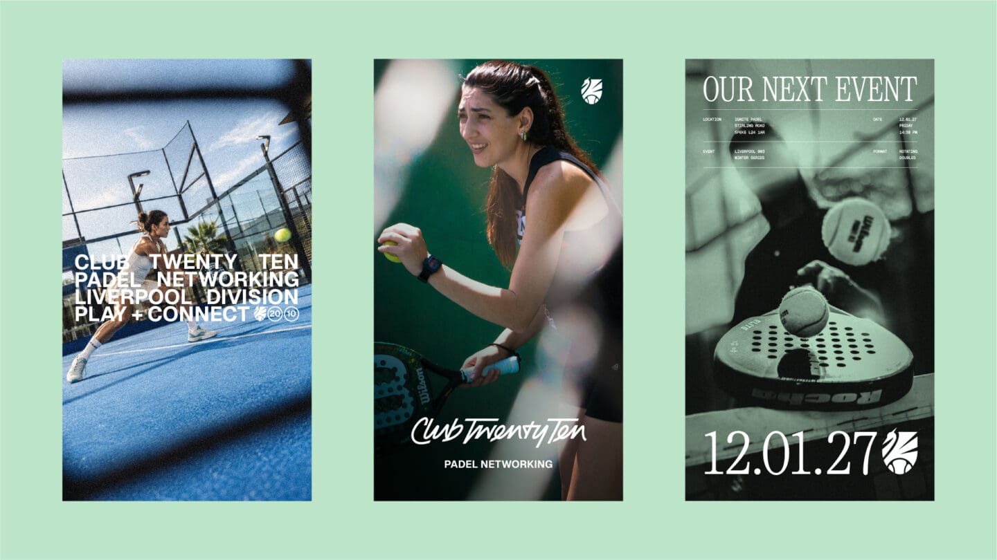
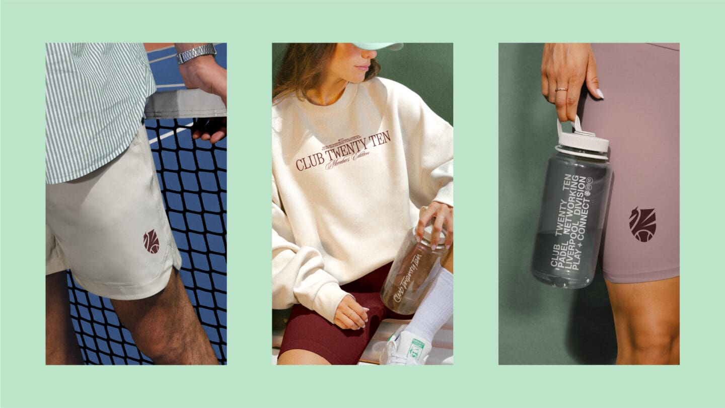
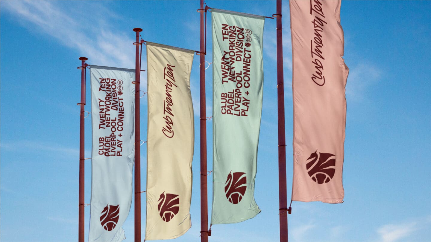
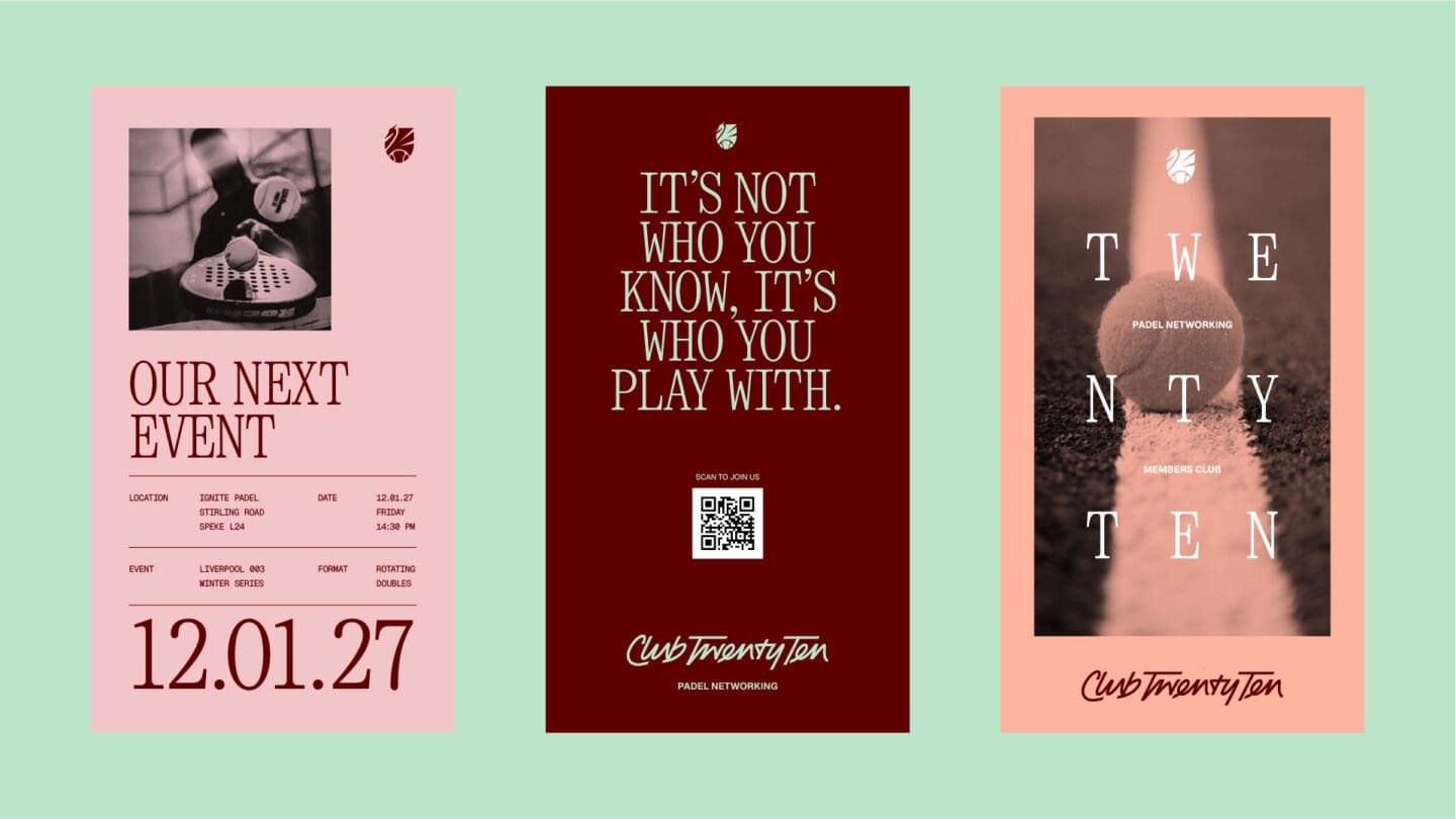
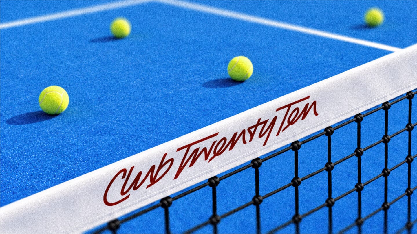
The goal was to build a confident, recognisable identity with plenty of flexibility. I developed a custom-drawn script wordmark and club crest, supported by a bold typographic style and playful graphic language. The idea was to create something that felt like an established sports club but with a contemporary, social twist.
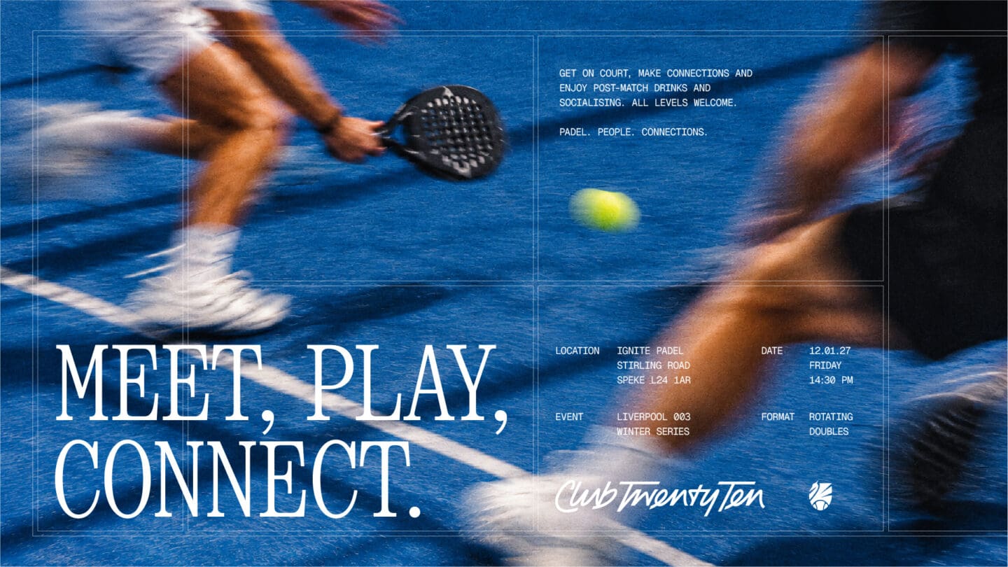
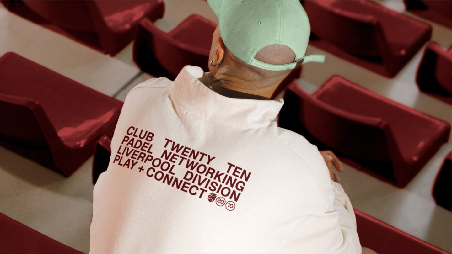
The result is a distinctive, energetic identity that works across everything from digital content and event graphics to merchandise and apparel. The combination of bespoke lettering, a recognisable crest and a flexible visual system gives Club Twenty Ten its own personality, creating a brand that people can feel part of, not just play for.