Nonno’s Coffee Shop
Deliverables
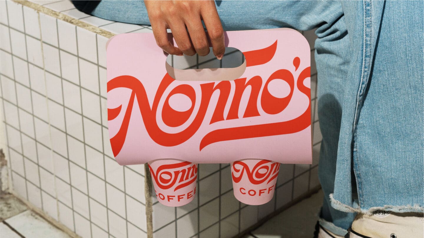
Nonno’s originally launched with a DIY logo to get the business off the ground, but one year later they were ready for a more considered identity that reflected the atmosphere of the shop and gave the brand more variety across future touchpoints. The challenge was to create something nostalgic and full of personality, without feeling overly themed or restrictive.
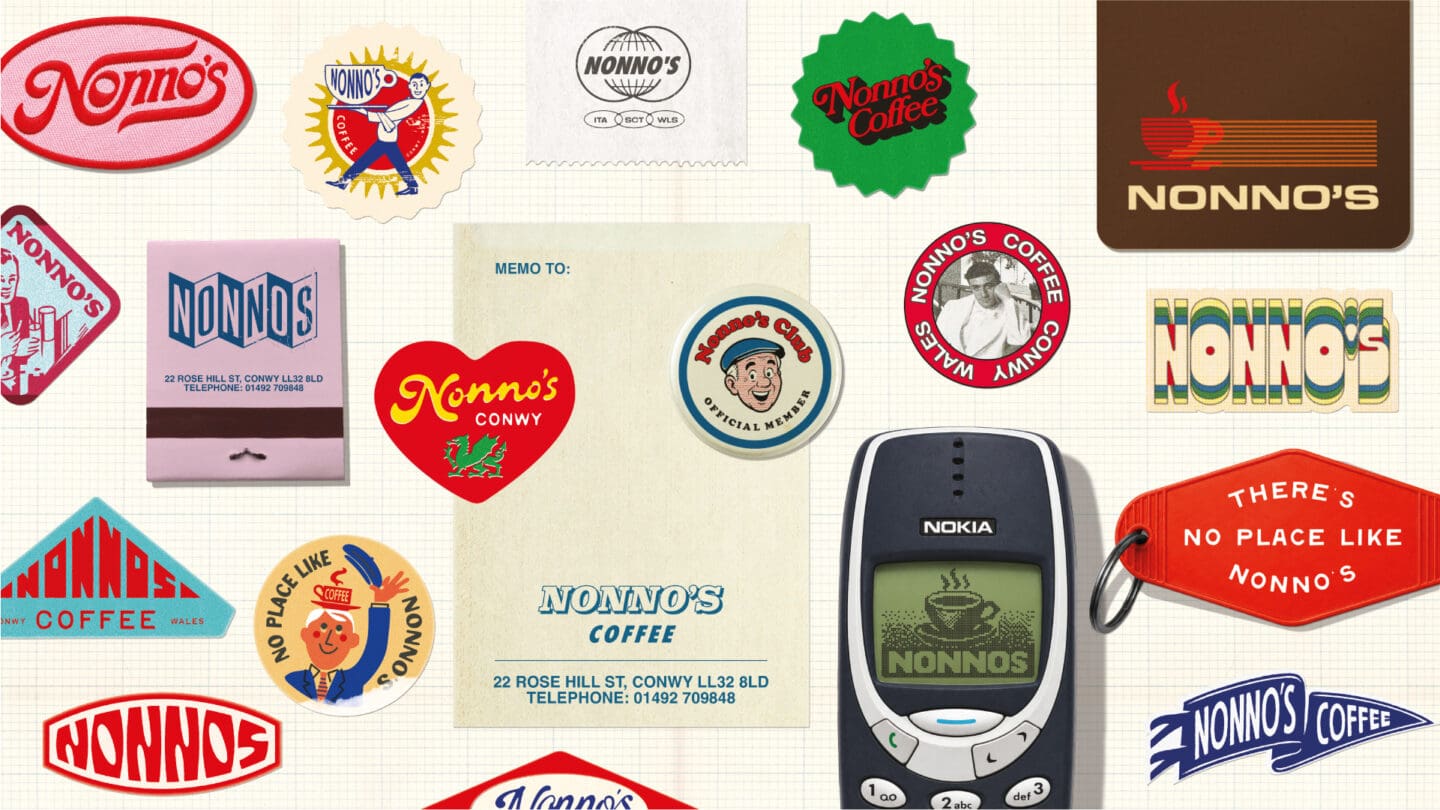
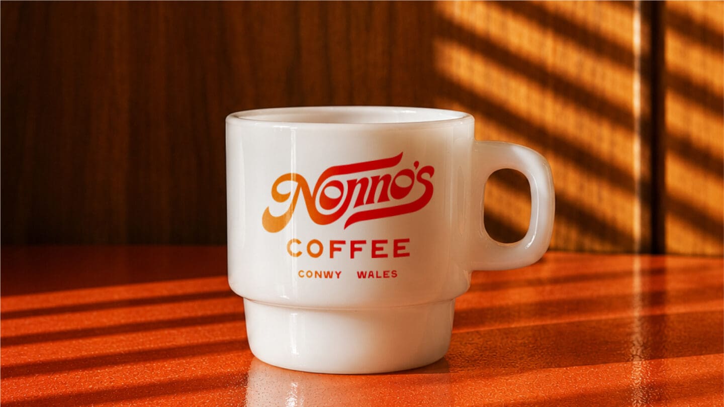
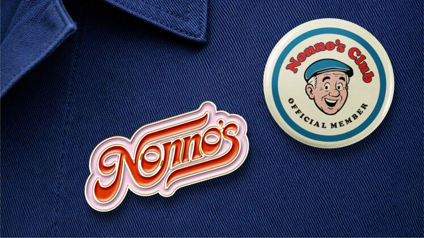
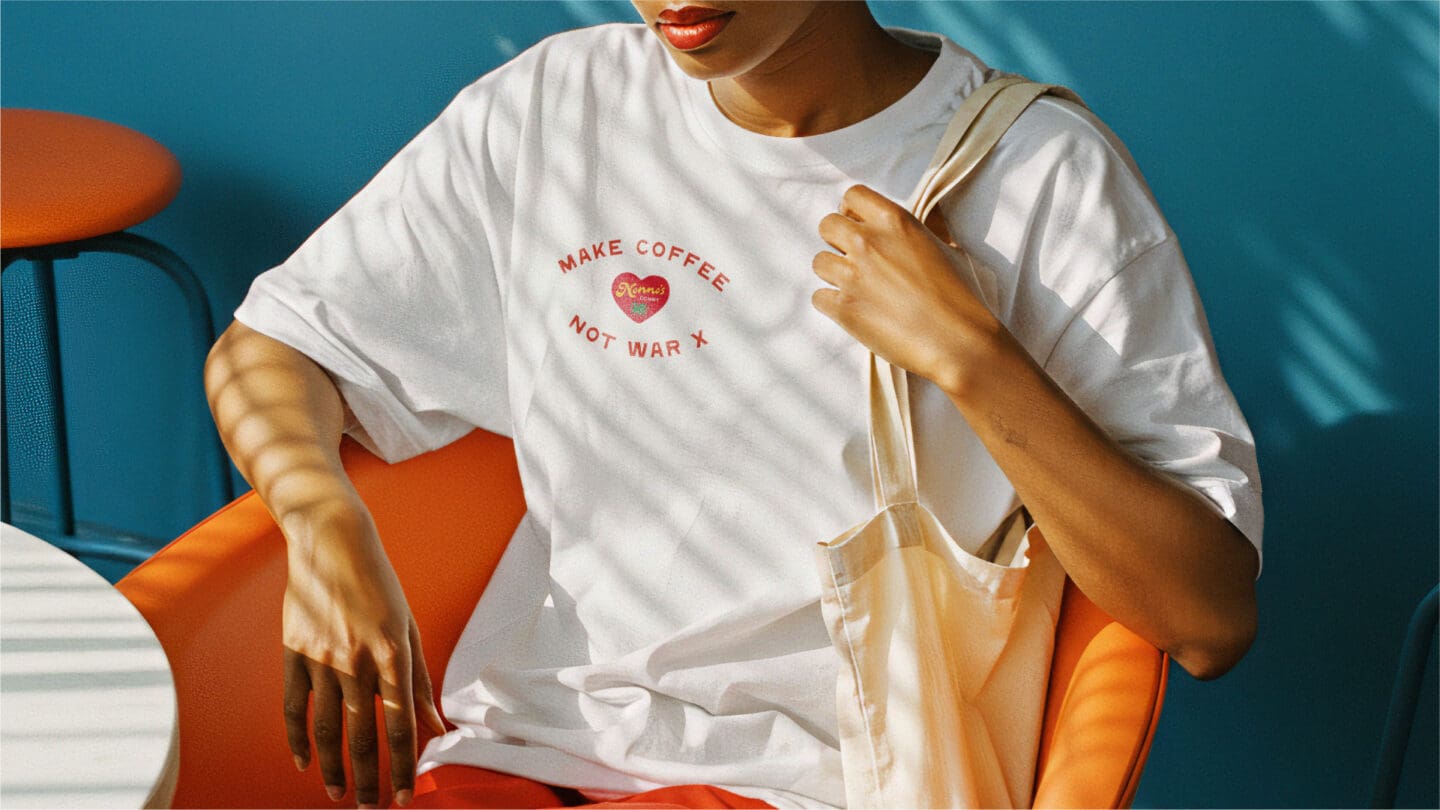
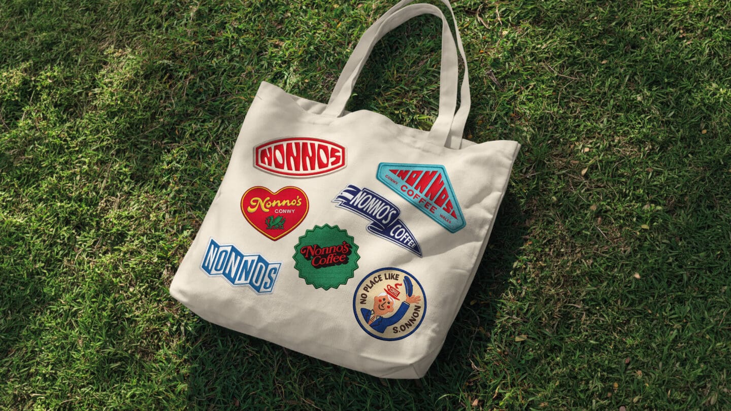
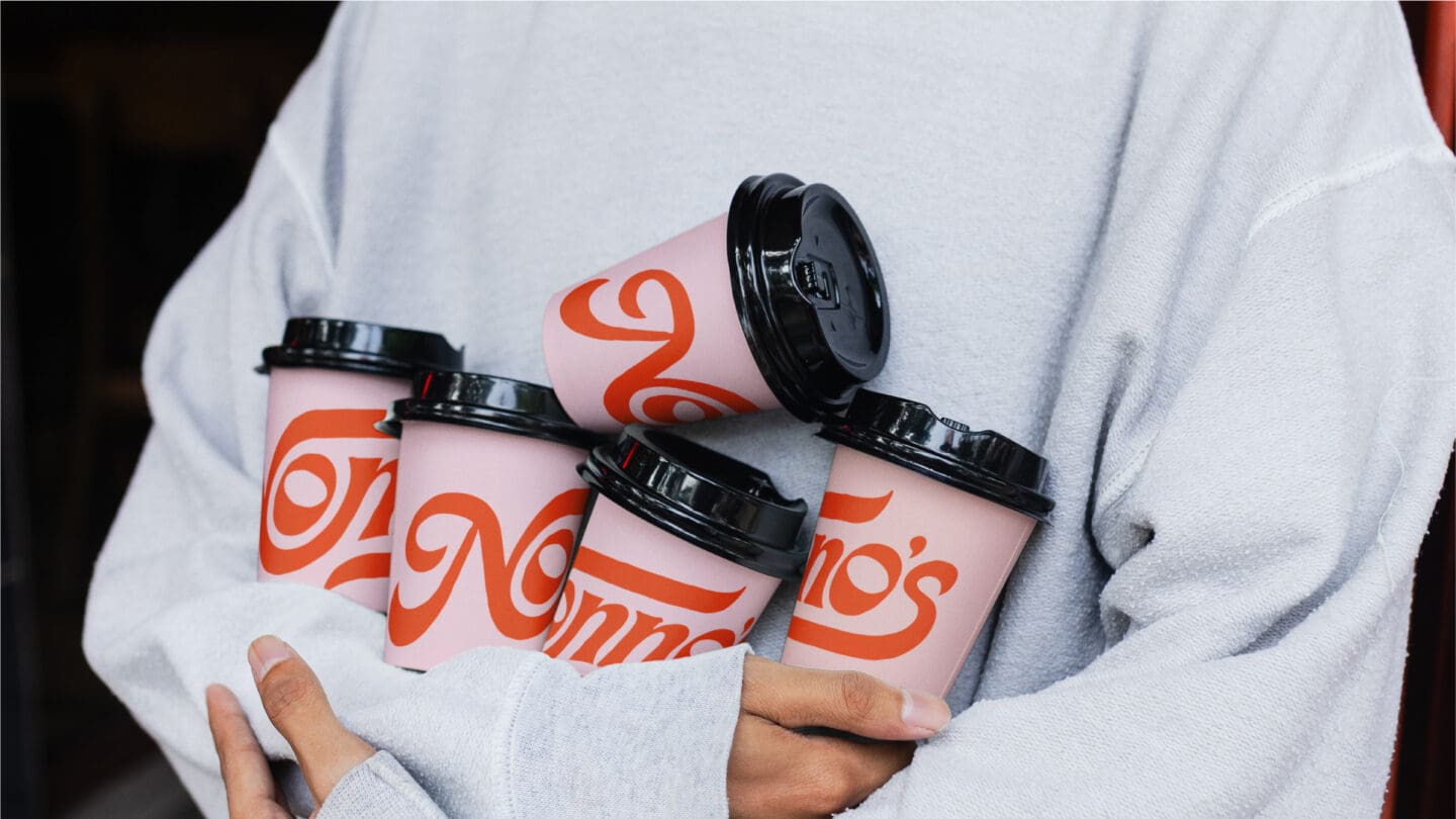
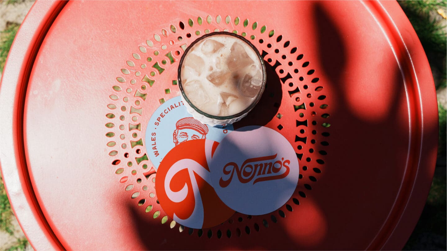
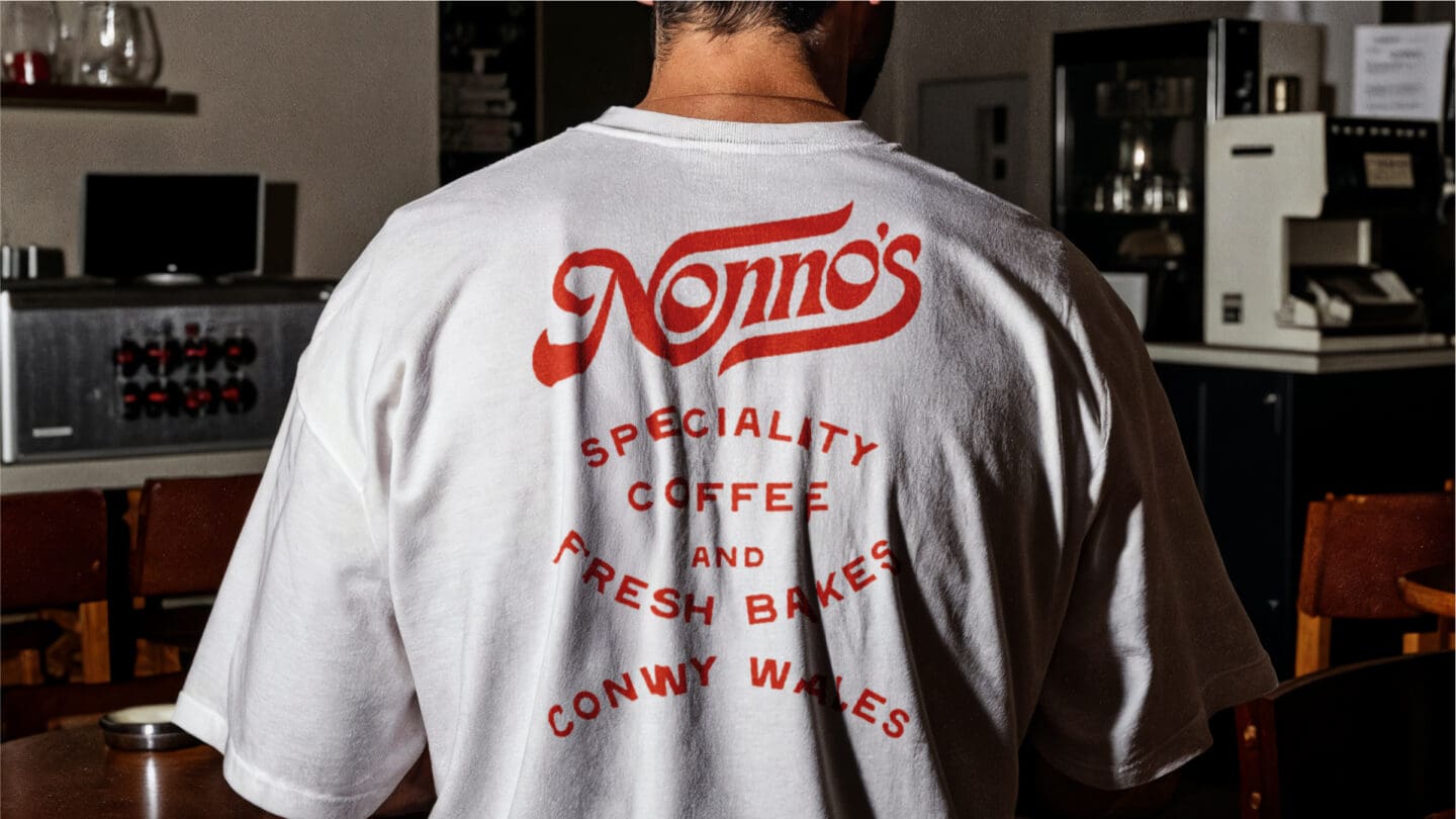
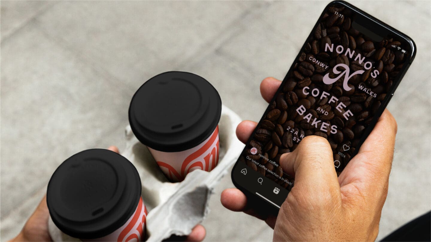
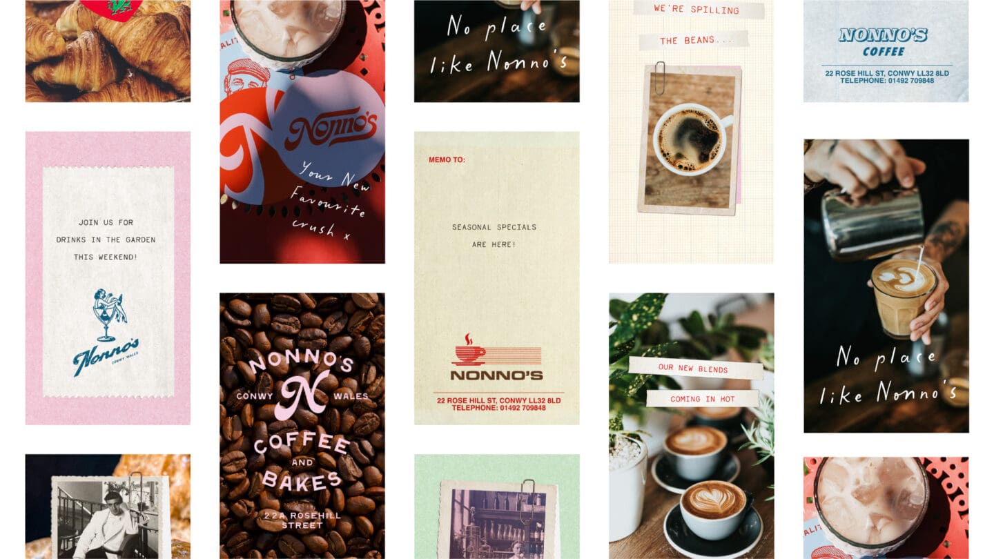
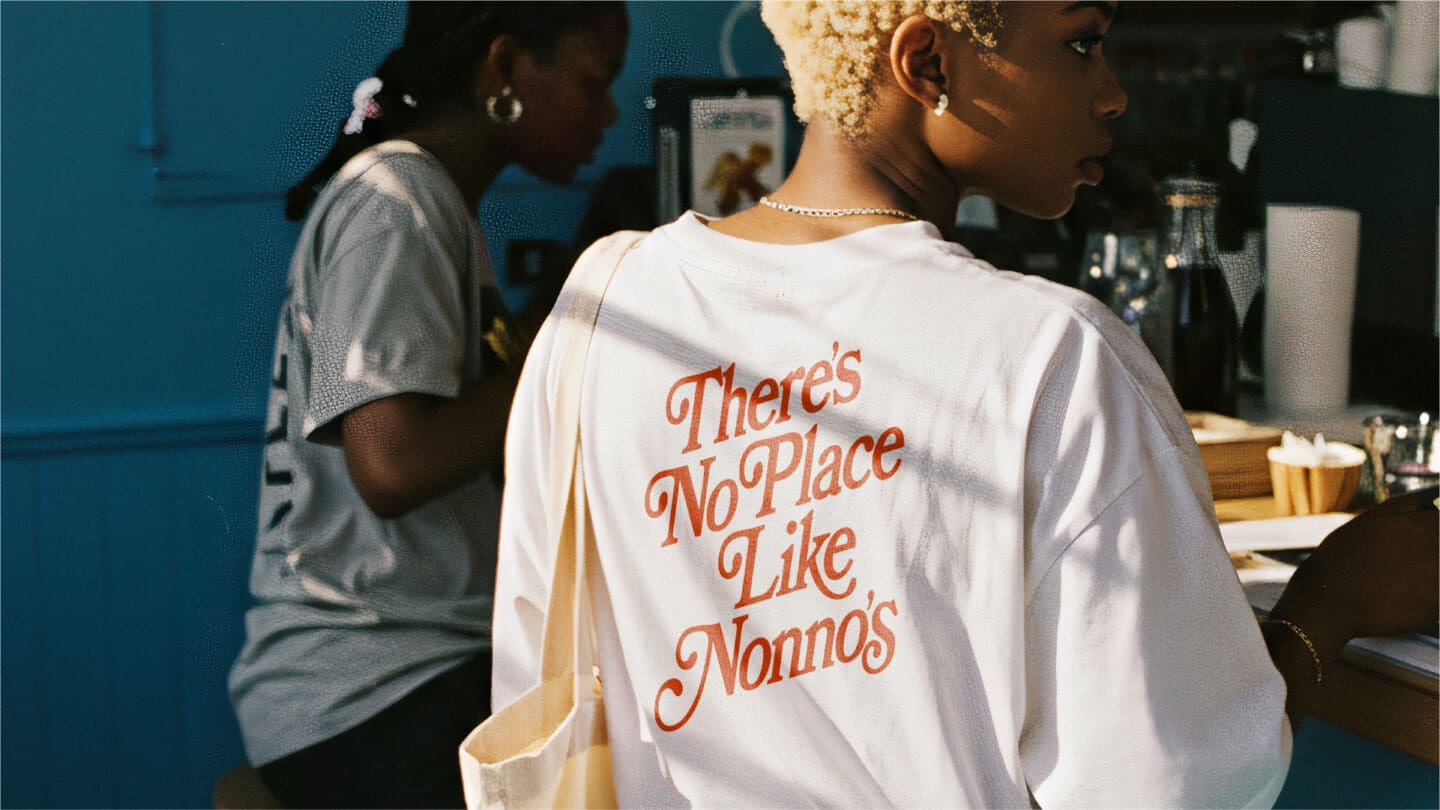
The goal was to build a flexible visual identity inspired by the eclectic interior and relaxed atmosphere of the coffee shop itself. I created a custom hand-drawn wordmark alongside a suite of retro-inspired Nonno logo variations designed to work across packaging, merchandise, social content and in-store applications. Supporting scrapbook-style graphics were introduced throughout the identity to reinforce the vintage feel and give the brand a playful, expressive visual language.
The result is a distinctive and characterful identity that gives Nonno’s far more flexibility in how the brand shows up across both print and digital spaces. The new system balances consistency with creativity, allowing the business to evolve its marketing while keeping the relaxed personality and nostalgic charm that makes the coffee shop unique.